Mellau Consulting
Sequence view
|
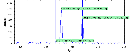
Using the SequenceViewer program you can display the A, C, G and T traces and label the peaks with the software/user determined sequence symbols. How to load/import a CE data file is explained in the DNAMatch manual. If you select an imported CE DNA Sequence file you can display a selected region on the PlotArea as shown on the next figure |
||||
 |
||||
|
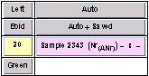
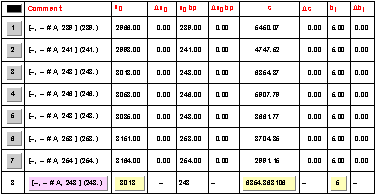
If a single trace is selected a table with the selected peaks and their parameters is shown. |
||||
 |
||||
|
and also only the selected blue trace is displayed
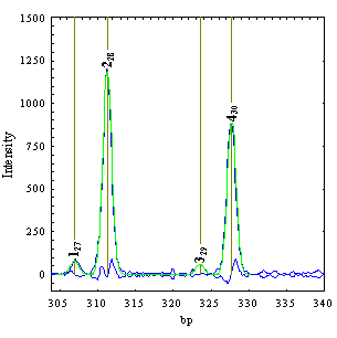
The plot range and additional plot options can be set up in the PlotManager table shown in the next figure:
The user can shift the plot range left, right, up or down. He can zoom in and out the x axis region, zoom in and out the y axis region, zoom in and out the x and y axis regions, autoscale to data file maximum x axis region, autoscale to data file maximum y axis region, autoscale the y axis for the selected x axis region. The data curve can be plotted as curve, as data points or as both curve and data points. The user can manually set the x and y axis plot range, and the plot height and length on the screen. Peaks defined in the PeakList can be shown as vertical lines and/or as labels on the peaks.
By using the implemented procedures, the user in this section can also change the peaks corresponding to each data trace. New peaks can be manually inserted in an interactive mode before or after an existing peak. To insert a new peak, one has to select a peak from the PeakList table. The peak manipulation functions (Insert before, Insert after or Delete buttons) are regarded relative to this selected peak. As an example the next figures show how the Insert after procedure works. The user wants to insert a peak between the second and third peaks. First it has to select the second peak from the PeakList and then click on the Insert after button. DNAMatch now will search in the x axis region between peaks 2 and 3 for the most intense peak that is not in the PeakList and inserts the new peak in the *.pek data file. At the end of this procedure the plot display changes as shown in the right figure displaying the new peak.
The PeakList table will be also updated with the new peak and its parameters. The peak is calibrated using the second level calibration function (interpolation between the imported bp values for peak 2 and 4) as shown in the x0 bp column.
|

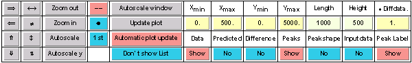

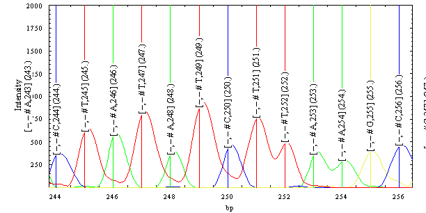
 By switching the Show List button on, the PlotManager will display the list of all imported peaks in the plot region as
shown in the figure (you can autoscale the plot window to view all peaks). The PlotManager table is extended with an
additional column where the user can set up different options which define what kind of information should be shown in the
table. Any data regarding a peak (label, position, area etc.) can be manually changed, and the changes can be inspected on the data plot.
By switching the Show List button on, the PlotManager will display the list of all imported peaks in the plot region as
shown in the figure (you can autoscale the plot window to view all peaks). The PlotManager table is extended with an
additional column where the user can set up different options which define what kind of information should be shown in the
table. Any data regarding a peak (label, position, area etc.) can be manually changed, and the changes can be inspected on the data plot. By switching Peak label on, two additional columns are shown in the PlotManager table. These buttons define the
options of the peak labelling on the plot. These option buttons are shown in the figure on the left.The user can change
the font size of the peak labels, the font face (plain, bold, italic), the label orientation (up, left, right, centred to peak
position), the background of the peak label, the label position (user defined, automatic using peak positions etc.), what
to show (saved peak label, automatic peak label using label descriptor or automatic label appended with saved label).
The user can define a so called peak descriptor. This is an arbitrary text expression with user text /predefined text elements. The predefined text elements (as No
for the peak number on the window, Any absolute peak number in the peaklist, x peakposition in time etc.) are replaced for each peak with the actual values. The
following figure shows another plot with changed peak labelling options and the PlotManager settings for this plot.
By switching Peak label on, two additional columns are shown in the PlotManager table. These buttons define the
options of the peak labelling on the plot. These option buttons are shown in the figure on the left.The user can change
the font size of the peak labels, the font face (plain, bold, italic), the label orientation (up, left, right, centred to peak
position), the background of the peak label, the label position (user defined, automatic using peak positions etc.), what
to show (saved peak label, automatic peak label using label descriptor or automatic label appended with saved label).
The user can define a so called peak descriptor. This is an arbitrary text expression with user text /predefined text elements. The predefined text elements (as No
for the peak number on the window, Any absolute peak number in the peaklist, x peakposition in time etc.) are replaced for each peak with the actual values. The
following figure shows another plot with changed peak labelling options and the PlotManager settings for this plot.